| Rank | Team | Logo | Trending | Comments |
|---|---|---|---|---|
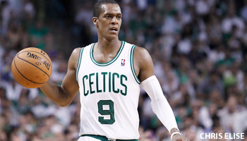
| 1 | Boston Celtics | — | Still the class of the league. No goofy side panels, no extraneous bells or whistles, just a perfect vertically arched wordmark and a simple green-and-white color scheme. Remember the rule about classics: They got to be classic for a reason. | |
| 2 | Los Angeles Lakers | +1 | Ideally, a uniform should be viewed in a vacuum, strictly on the basis of its aesthetics. But every now and then there'll be a team that's so consistently successful on the field (or the court, or the ice) that it creates an aura of quality about the entire franchise, an aura that can extend to the team's uniforms. The Lakers fall into that category. Are their uniforms really so good, or do they just seem that way? Either way, they've achieved that rarefied status reserved for upper-echelon designs. The only fly in the ointment is the white alternate uni. Come on, guys, you used to be special because you were the only team in the league without a white uni. | |
| 3 | San Antonio Spurs | -1 | Love the way they use the spur as the "U" in their jersey insignia. It's such a small, simple thing, but it instantly elevates them above all the teams that just use standard typography. Great silver/black color scheme, too. Docked a notch for wearing that alternate uni too often in last season's playoffs. | |
| 4 | Utah Jazz | +1 | The Jazz have now been in Utah for 34 years (longer than you realized, right?), and they've never looked better than they do right now. Sure, the team name is a bit incongruous, but nobody complains about the Lakers' or Dodgers' names, even though there are no lakes to swim in or trolleys to dodge in L.A. So forget about the Jazz's name and just dig the excellent threads. | |
| 5 | Golden State Warriors | -1 | The NBA's most interesting uniform set got even more interesting last season, thanks to that alternate uni with the sleeves. Yeah, it looks absurd, so the Warriors have dropped a bit in the rankings, but here's the thing: That sleeved jersey would actually look pretty good if not for the pinstriped shorts. Here's hoping they go with basic gold shorts instead this season. | |
| 6 | Miami Heat | +2 | Way too many variations on the same basic theme, but the theme is a good one, highlighted by the flaming "T" -- a brilliantly simple detail that totally works. Why can't other teams come up with something like this? No extraneous nonsense under the armholes or on the shorts. Such a solid set that you can almost forgive them for having a team name that doesn't end in "s." | |
| 7 | Washington Wizards | -1 | If you're too young to remember the Washington Bullets, well, they didn't look exactly like the Wizards' current set, but the resemblance is pretty obvious. Aside from being a nice shout-out to DC's hoops heritage, these uniforms are also miles better than any of the Wizards' previous designs. One of the better uni-related success stories of recent years. | |
| 8 | Oklahoma City Thunder | -1 | The NBA has been in a minimalist phase over the past four years or so, with teams such as the Thunder, Sixers, Nets, Cavs and Pelicans all unveiling very conservative designs. The Thunder's set is the best of this lot, thanks in large part to the orange trim, which really pops. The road design would probably be stronger if they put "City" below the uni number instead of stacking the two words, but it still works. Too bad about the alternate uni, though, which is one for the "What were they thinking?" file. | |
| 9 | Portland Trail Blazers | +1 | Last season the Blazers gave their red alternate uni a really sharp updating. See how the tapered diagonal stripes now look more like a wagon wheel pattern from the Oregon Trail? Here's hoping they apply that same approach to their home and road designs. | |
| 10 | Chicago Bulls | +3 | The Bulls have been using black lettering and numbering on their road jersey for 40 years now. Prior to that, though, they used white type with black outlining. Wouldn't mind seeing them go back to that style. And of course they should scrap the black alternate uni. | |
| 11 | Phoenix Suns | +5 | This brand-new uni set, unveiled just a few days before the Power Rankings went live, will need to log some time on the court before we can fully evaluate it, but the early indications are promising. The whole package feels like a very tasteful updating of the Suns' 1990s look, and the orange gradient on the home lettering looks particularly sharp. Even the sleeved alternate works. One serious fly in the ointment, though: the wraparound butt striping on the shorts. | |
| 12 | Detroit Pistons | -1 | How great would it be if the Pistons revived their old Ft. Wayne Pistons mascot character? OK, so that's not going to happen, but the new "Motor City" alternate uni helps give this set some much-needed zip. | |
| 13 | Brooklyn Nets | +16 | It'll take a little time for this austere design to grow into its own, but the early returns are very promising. Kudos to the team and the league for having the guts to go with such a simple, no-frills approach. It works. | |
| 14 | Indiana Pacers | -2 | A basketball uniform doesn't leave much room for creative design. There's no headwear, no long pants, no sleeves, no team-colored socks, and the players are required to wear uniform numbers on the front of the jersey, which eats up a lot of the available space. As a result, you end up with lots of middle-of-the-road designs that are neither wonderful nor awful -- they're just adequate. The Pacers' set is a prime example. | |
| 15 | Philadelphia 76ers | -1 | If they had worn this set for the past 30 years, we'd probably think of it as a classic. For now, it just seems a bit dull. Then again, dull is better then some other designs they've worn. Suggestion: Redesignate the blue alternate as the primary road uni. | |
| 16 | New York Knicks | -7 | The good news is that the Knicks finally got rid of the black trim last season. The bad news is that they reduced the arching on their chest lettering (looks kinda amateurish now), and can someone please explain what the deal is with those thick waistbands on the shorts? Looks totally 1980s junior-high gym class. | |
| 17 | Denver Nuggets | +1 | Sorry, but that type font just cannot be taken seriously. The rounded letters and numbers look so juvenile, like they should be spelling out, "Happy 10th Birthday!" On the plus side, the retro-style alternate, which they began wearing last season, is serious fun. | |
| 18 | Memphis Grizzlies | -1 | I have this friend. He used to be a blast to hang out with, but he was also pretty wild -- drank too much, did too many drugs, got into too much trouble. Then he cleaned up, got sober, and settled into a fairly conventional life. I'm happy for him, and I'm glad I no longer have to deal with his insane antics, but there's no denying that he was a much more interesting character in his wilder days. That's how I feel the evolution of the Grizzlies' uniforms. Like, I know it's for the best, and the wild style was unsustainable, but things sure feel a lot less interesting nowadays. | |
| 19 | Houston Rockets | — | The stripes on the Rockets' shorts might have worked back in the era when basketball shorts were actually, you know, short. But with today's billowy NBA uniforms, those stripes look too swoopy -- the effect is almost clownish. Also, the chest lettering feels scratchy and primitive, which doesn't match the team's space-age name. Also-also, the "R" logo on the shorts is supposed to look like a rocket blasting off, but it really just looks like dripping paint. | |
| 20 | Atlanta Hawks | — | Classic example of a safe, boring uniform template that could be applied to virtually any team. Inoffensive, sure, but also unimaginative. Remember when this team used to break the mold? | |
| 21 | Toronto Raptors | — | The Raptors are reportedly considering a full rebranding, including a name change, and not a moment too soon. They've never even settled into a consistent color scheme, much less a consistent visual identity. Time to start over. | |
| 22 | New Orleans Pelicans | -7 | Well, you certainly can't say they overdesigned it. But doesn't it seem odd to give your team a new name and then not use that name anywhere on your uniforms? And isn't even odder to use such small lettering for your city name? It's actually smaller than the players' names on the back! | |
| 23 | Milwaukee Bucks | -1 | This team once had one of the best logos in pro sports. Now it's a poster child for uninspired design. Too bad. | |
| 24 | Cleveland Cavaliers | -1 | You know your uniform program has a problem when the most dynamic thing about it is the striping on the waistband. | |
| 25 | Dallas Mavericks | -1 | Mark Cuban has announced that the Mavs will have new uniforms for the 2015-16 season, and he's evenasked fans to submit their own design ideas. Whatever the new uni set turns out to be, let's hope it doesn't have navy lettering on a royal jersey (hard to read, don'tcha know). Or pointlessly off-center uni numbers. Or idiotic panels on the back of the shorts. | |
| 26 | Los Angeles Clippers | -1 | Memo to the Clippers: You're doing better on the court these days, and that's great. Congrats! Now it's time to do something about your visual approach. For starters, everyone -- everyone -- views your logo as a cheap imitation of the Lakers' logo. That needs to change, like, yesterday. Once that's taken care of, we can address your uniforms, which look like they were picked up on closeout at the discount store. | |
| 27 | Charlotte Bobcats | -1 | A fairly obvious Mavs knockoff. At least we won't have to look at it much longer, because the team will be rebranded as the Hornets in 2014-15. | |
| 28 | Orlando Magic | -1 | Orlando's original uni set felt like a fun party. Over the years they've chipped away at that design, removing most of the interesting details, and all that's left now is a boring, watered-down version of the original. Disappointing. | |
| 29 | Minnesota Timberwolves | -1 | This team has never had a workable look. Instead, they've featured one pointless gimmick after another (the illegible typeface, the "tree line" on the shorts, the odd collars, etc.). Blow the whole thing up and start over. | |
| 30 | Sacramento Kings | — | The scary thing is that it could actually be worse, as they reminded us when wearing their two-tone 1990s throwbacks last season. |
Le maillot des Celtics, le plus beau de NBA devant ceux des Lakers et des Spurs ?
Selon ESPN, le maillot des Boston Celtics est le plus beau de toute la NBA, devant ceux des Los Angeles Lakers et des San Antonio Spurs.